Hey there,
Sometimes I like pink, sometimes not. There are occasions when I wear pink clothes or accessories, but it’s a fact that when it comes to flowers or home decor, the color pink is unavoidable and trendy to use.
In this post, we’ll explore what other colors complement pink, which color palettes create a youthful and refreshing effect, or which shades of pink are suitable for a wedding or other design projects. Come and get inspired!
Pale pink- The timeless trend and Feminine charm
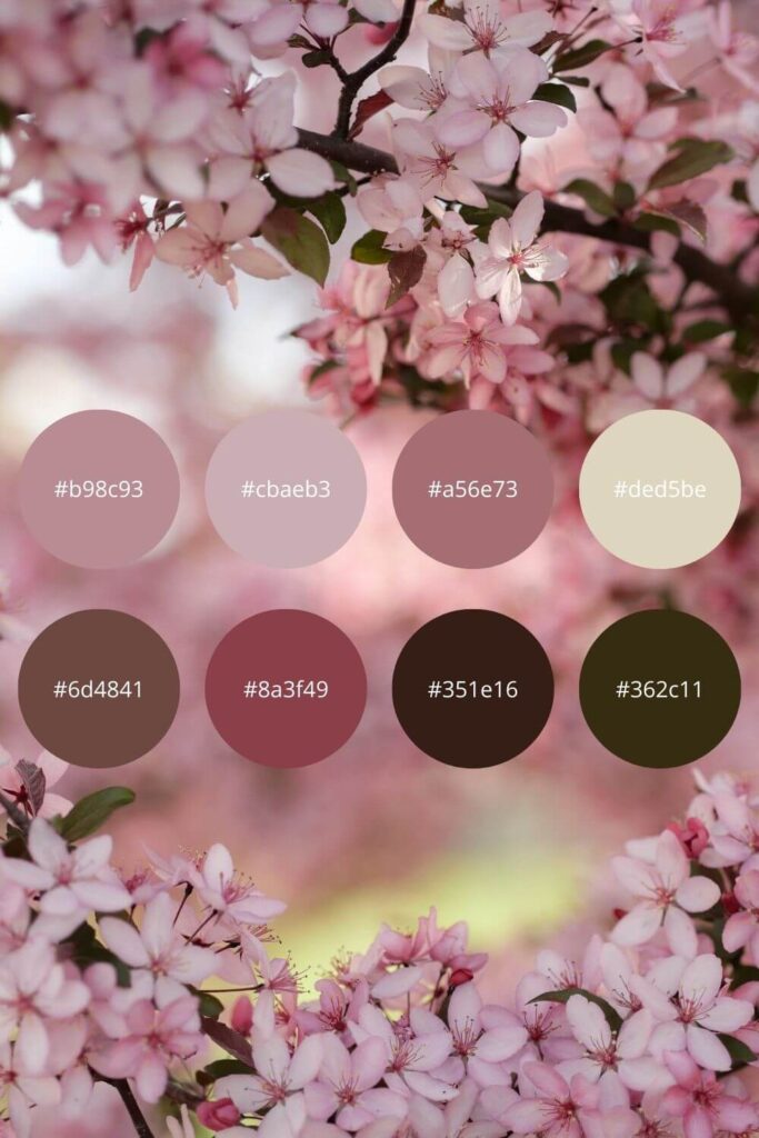
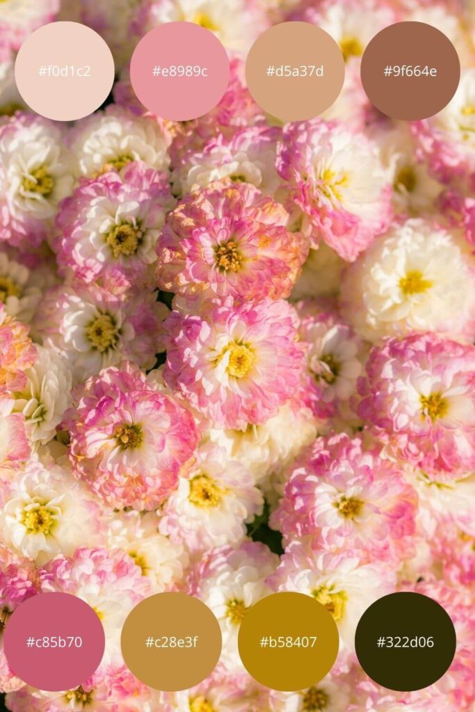
Spring is coming, you can feel the warmth in the air, and pale pink flowers, like cherry blossoms, are slowly beginning to bloom. Our first color palette is built around pastel shades.
Creamier, blush pink shades dominate here, complemented with a hint of green and/or brown. This color combination can be perfect for a bedroom wall or even makeup.
Pink and Green- A color duo for a Vibrant look
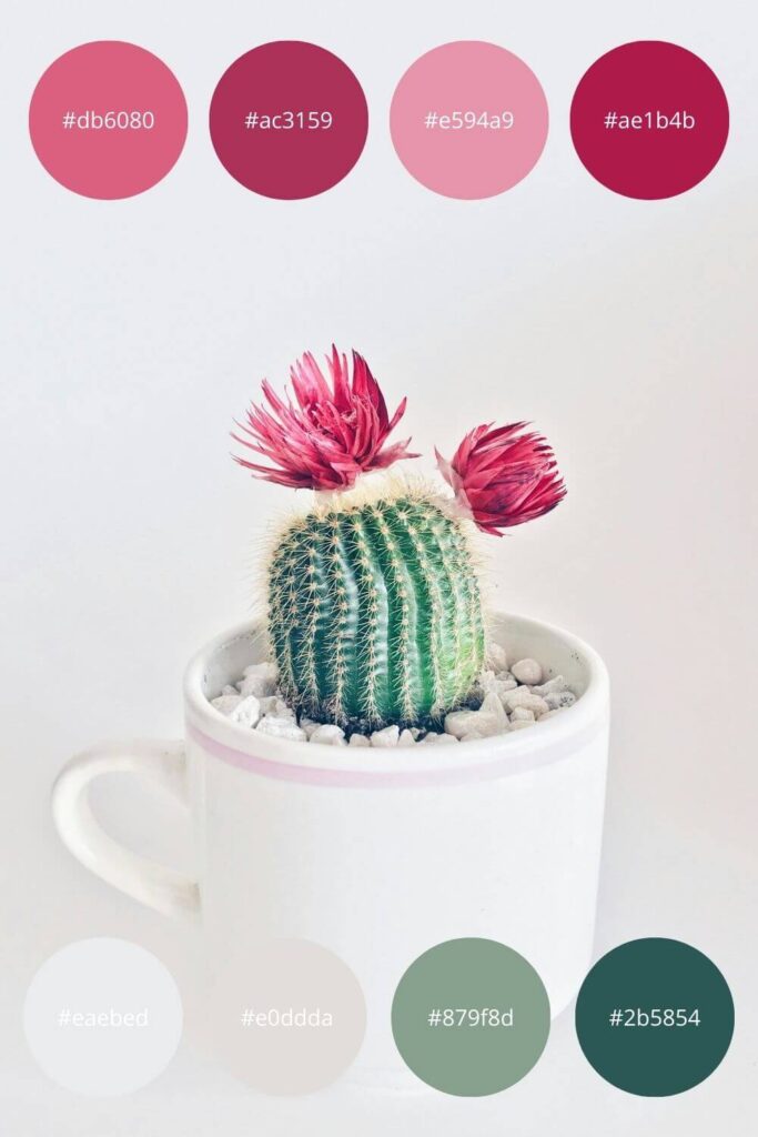
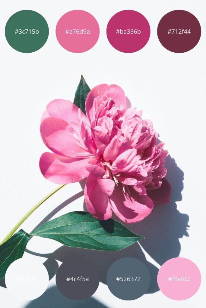
Staying with lighter shades, in the next case, you can see how well the warm green and warm gray colors complement the shades of pink.
These color palettes can be perfect for a spring wedding, or clothing design when seeking a youthful and refreshing effect. They can also work well for designing your own logo or custom design.
Dark Pinks – Elegance and Mood
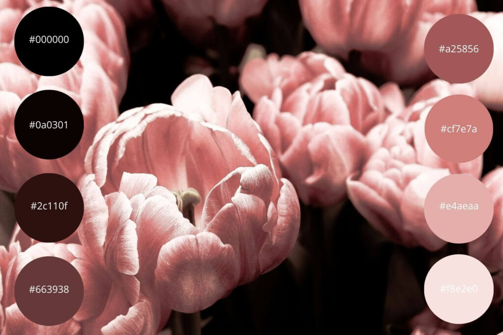
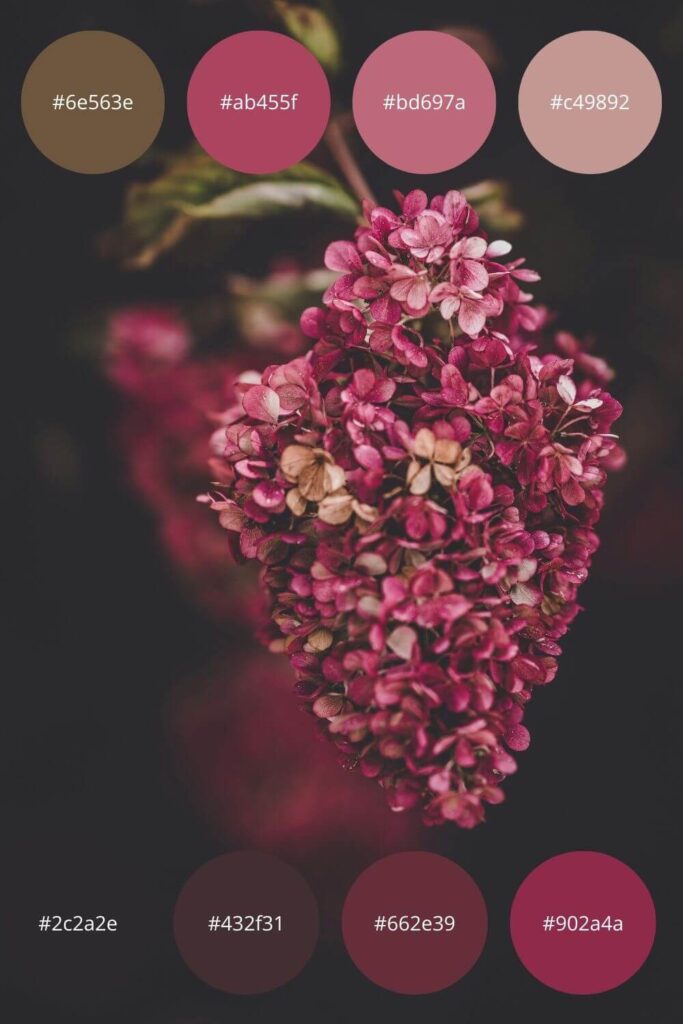
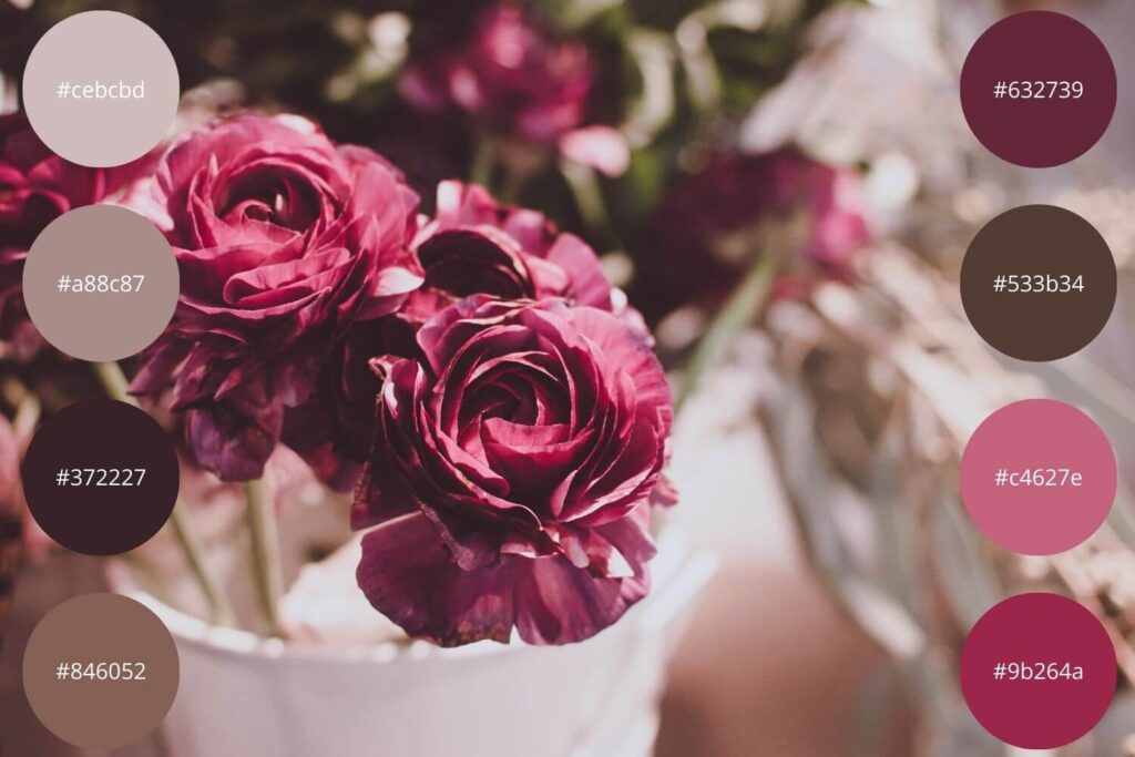
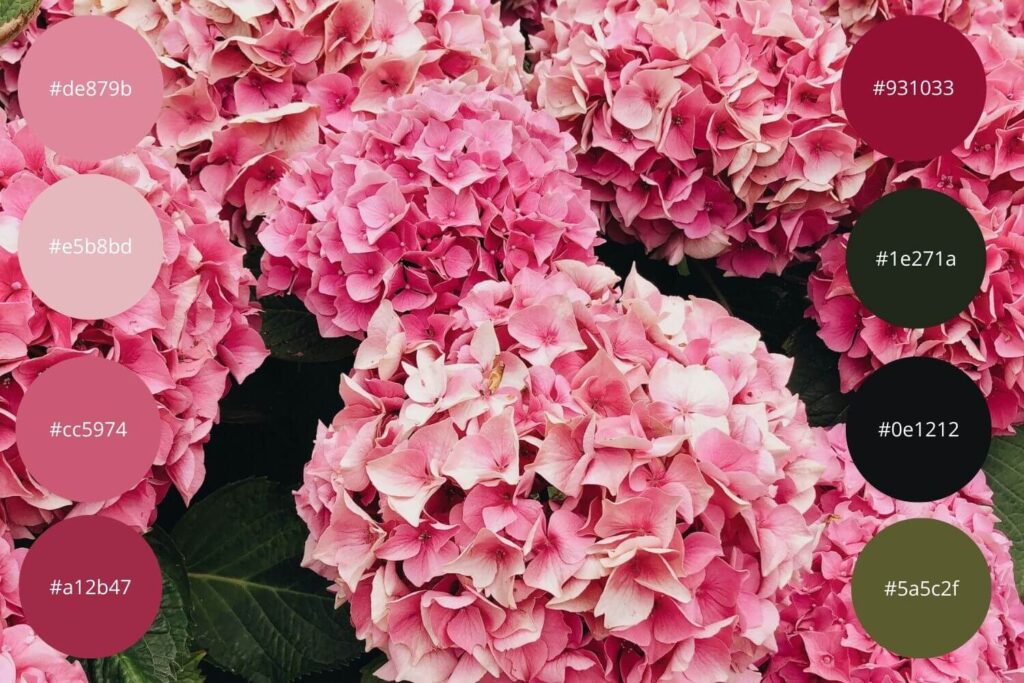
When discussing the color pink, many people think of a seemingly unmatched shade. However, we are now examining one of the most beautiful shades. This is the dark pink.
If we want tranquility and peace around us, then definitely choose the color of the room’s walls or accessories in our home from among these color shades. Dark colors exude warmth, so it’s a good idea to complement our bedroom with such shades. Feel free to deviate from the usual and use dark bedding with dark pink pillows. I guarantee the effect will not disappoint.
Pink and Purple – Unleashing Your Creativity
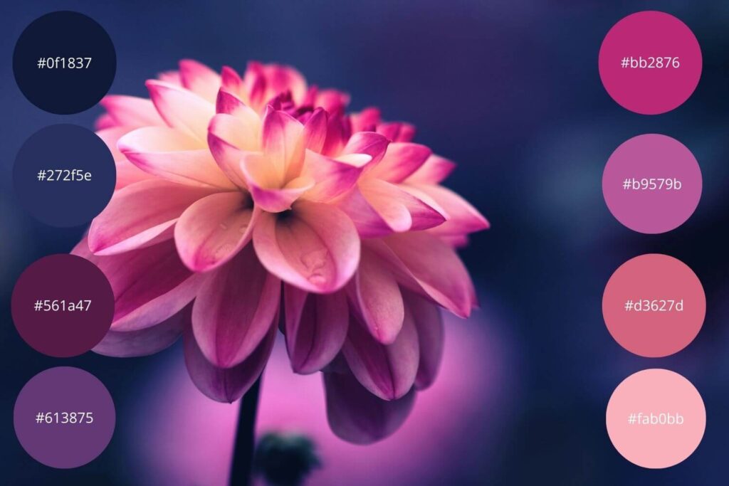
When we think of these two colors, the first thing that might come to mind is the hippie vibe or some chaotic 70s style. Well, we’re not far from the truth. With these shades, we are going to fill our home with life.
These shades bring freshness and vitality into our everyday lives. Just imagine the difference we’ll experience if we place a bouquet in these colors in a pure white room. These shades are perfect for creating the decoration of a girly party or for decorating our living room with pillows in these colors. If we’re feeling bolder, we can replace our current sofa with a dark purple shade and accentuate it with light pink pillows.
Pink, Yellow, and Orange – Capture the Vibrancy
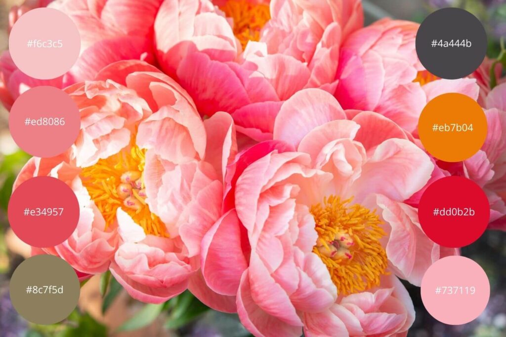
Pink and yellows. If the previous color palette evoked the hippie vibes, then the current one symbolizes strength and dominance.
If you haven’t felt the spring vibe in the previous palettes, you surely will with these. These are strong, dominant colors, perfect for displaying on an entryway wall, adorning a wreath on your front door, in your kitchen in the form of a bouquet, or typically in a teenage girl’s room.
Basic Pink Palette – Playfulness with Jolly Joker hues
When I say “basic,” understand it as a strong foundation! These are the shades that can be used anywhere, for anything.
With the shades on the left, we can add a touch of femininity to any space, while on the right, there are colors from which we can create a perfect, elegant bathroom or living room.
Conclusion
In this blog post, we talked about the various shades of pink, complementary colors, and their applications. Interestingly, we presented this through plants. I hope you found it inspiring, and beyond bringing a springtime feel to your life, you’ll also use one of the color palettes for your next DIY project.

0 Comments